Re: Good Design
Posted: Tue Apr 03, 2012 4:33 pm
Oh I like that!
What a super shot and concept!Gerry D wrote:Something for all of ye music loving photographers on here ...
http://www.lostateminor.com/2012/03/31/ ... struments/
I'd love to get a large print of that framed.Gerry D wrote:Something for all of ye music loving photographers on here ...


Keep on Turnin’
Keep on Turnin’ is a minimal stereo system by German designer Valerie Hebel that combines analog and digital music in one sleek item. The all-in-one arrangement includes a turning table, CD player and an iPod docking station. It even has a cool colourful storage compartment for your vinyls. Thanks to its elegant appearance, Keep on Turnin’ does not look like a piece of technology, but rather makes an aesthetic statement in the space it occupies. Here is how the designer describes it:
Listening to vinyl is a way of life: the gentle lowering of the needle, the uniform rotation of the plate, the characteristic cracking during the playback, is a celebration of music. Keep on Turnin’ is a stereo system that brings back the pleasure of music. As an alternative to the usually identical and mostly technical design of stereo systems it should find its place as a piece of furniture. It convinces by its sound experience and serves a decorative quality piece of furniture.


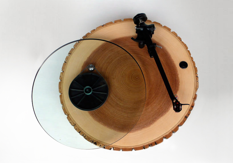
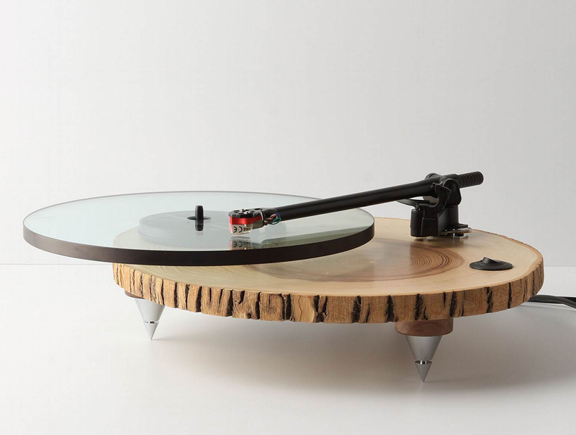
Gerry D wrote:Cute take on the Rega ...
I'm guessing that the Fotogrfr just forgot the counterweight !
My my my that truly is lovely!Gerry D wrote:Heres one for the Craftsmen amongst you all.
By a guy called Joe Swilley in America.
Redesigned Thorens 160.
American Walnut with Ebony legs.